I can’t do a series on public speaking for scientists without laying down a few guidelines on Powerpoint. A quick note: the best lecturers I had during my undergraduate days consistently shunned Powerpoint, preferring the blackboard. (Overhead transparencies, thankfully, seem to be dying out). One of the reasons for this may be that equations are much less intimidating when they appear gradually, term by term, rather than all at once. Lecturers who used the blackboard also seemed to have more time to think about what they would present and how they would present it, rather than using time to prepare slides.
Powerpoint, as we all know, can be used well and can be used extremely poorly. Here are the laws of Powerpoint – if I were Emperor of astronomy, non-compliance would be punishable by firing squad.
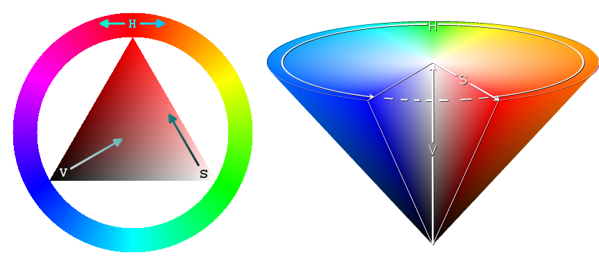
Rule 1: Contrasting colours
If I see one more person put a yellow line on a white background …
The RGB colour model is part of the problem. The RGB model (as used by Matlab) assigns a colour by a fraction for Red, Green and Blue. For example: white (1, 1, 1), black (0, 0, 0), dark purple (0.5,0,0.5). While blue (0, 0, 1) and red (1, 0, 0) are clearly seen on a white background, green (0, 1, 0) is invisible. So you’ll need to use (0, 0.5, 0). Many “default” colours need to be darkened. If you’re using a black background, lighten the colours (especially red). If you’re using a background that is some other colour than black or white, stop it. Stop it right now. Or consult the nearest colour wheel and choose opposing colours, one dark and one light. Test your colours on a projector – they always look better on a screen or on paper.
And use thick lines on plots. And large labels. Or else.
Rule 2: Few words
It’s very difficult to read and listen at the same time. The words you put on screen should be keywords, and as few as possible. Don’t write a complete sentence unless you plan on saying it word for word. Don’t write:
“Galaxy formation is thought to occur in two distinct modes. Cold accretion involves cold, neutral gas falling into galaxies along thin filaments. Hot accretion occurs when gas which has been shock-heated at the virial radius cools radiatively and collapses quasi-spherically.”
Instead, write:
Galaxy Formation:
1. Cold accretion – filaments
2. Hot accretion – spherical collapse
Don’t make too many points on one slide. The words on screen are an aid to memory and focus, but too many are a distraction.
If you’re going to show an equation, think hard about the point you’re trying to make. And then forget about it. Just show the quantities that go into the equation, represent the equation as a large, red arrow, and then show what comes out and why we would want to know that. Are we really going to learn anything from the formal definition of the angular trispectrum?
Rule 3: Show us what we’re looking at
The whole point of a Powerpoint presentation is the graphics – you’re going to say all the words. So use them properly. Tell what we’re looking at and tell us what it means! “The point is that this line fits the data very well”; “this shows the detail that our observations can achieve”; “the important feature of this spectrum is that bump there”. Most importantly, relate the features of the plot to the science.
Minimise the amount of work that the pointer has to do – use arrows and circles to draw attention to the important bits of the plot. Show us where to look and what to look for.
Rule 4: Uncluttered slides
There seems to be a certain style of Powerpoint presentation (often from an older generation) that tries to use as few slides as possible. Why use a new slide for each plot when you could take six plots and squish them all into one slide? Make them too small to see, and reveal them one after the other, slightly overlapping each other. In the end, your slide will exemplify “Powerpoint vomit”.
You want your audience to be focussed on one thing at a time. If you leave past plots and previous points on screen, then you give your audience every chance to become distracted. Don’t make your audience search the screen to find what you’re talking about.
Rule 5: Only animate graphics
There is no need to animate text. If you feel to need to animate your text, then you’ve probably got too many points on your slide. Start a new slide. Animated text is distracting, difficult to read and a waste of time.
On the other hand, videos are great. Everyone knows that. If you’ve simulated the collision of two galaxies, then show as much footage as you like. If you can simulate your plots to show how, for example, your model prediction changes as the parameters change, then that’s great. Never underestimate the human fascination with moving lights and colours, especially if it’s relevant.
And finally, for Pete’s sake, don’t deliver the talk to your slides. Look at us, and talk to the back row!!!
More in this series:
Public Speaking for Scientists:

All good advice – not new but worth repeating, as almost anybody who has sat through a few conference talks recently will know. See also
http://www.astro.keele.ac.uk/~jkt/goodtalk.html
for a similar take on powerpoint and other matters talk related.